There are many moving parts to pulling off a memorable music event or festival. From initial planning to stage production, each piece must come together seamlessly to create an unforgettable experience for attendees. One aspect that event producers sometimes overlook is the online event page – the dedicated webpage or ticketing page for the event. This page is more than just a digital flyer; it’s essentially an extension of your festival or concert, conveying the vibe of your event and serving as the primary information hub for your audience, a crucial factor given that a well-designed page can determine the difference between interest and purchase.
For potential attendees, your event page might be the first real encounter with your event beyond a social media post or poster. It’s where casual interest turns into a decision to attend. We’ve noted before that an event page should be at the heart of your marketing plan – and industry data backs this up. According to a 2025 festival marketing report, event websites account for about 41% of all ticket conversions. In other words, nearly half of your ticket buyers may come through a well-optimized event page, making it a channel you simply can’t afford to neglect. In 2025, having a professional event page isn’t just a nice-to-have – it’s expected. Without it, where will potential attendees find official details or buy tickets? If you have everything else in place but skip the event page, it’s almost as if your event doesn’t exist online. And with ticket scams on the rise—over £1.6 million was lost to fake ticket fraud in 2024 in the UK alone, prompting government warnings about gig ticket scams—fans are more likely to trust and purchase from a legitimate, dedicated event page than from a random social media link. Simply put, a strong music event, concert, or festival will always have a strong event page.
The good news is building a compelling event page is not as difficult as it may sound. With a few core steps, you can have a beautifully designed, high-converting page ready to go live. Below, we break down four simple ways to take your event page to the next level and ensure it truly pops for your audience.
Music Event Pages Solidify Your Event’s Existence
Imagine the journey from a fan’s perspective: they see an awesome teaser on Instagram or a lineup poster shared by a friend. Their interest is piqued, and the next thing they do is look for a link or website to learn more about the event. This is where your event page comes in. It validates that your event is real and happening, providing all the details an intrigued fan needs to move from curiosity to clicking “Buy Tickets.”
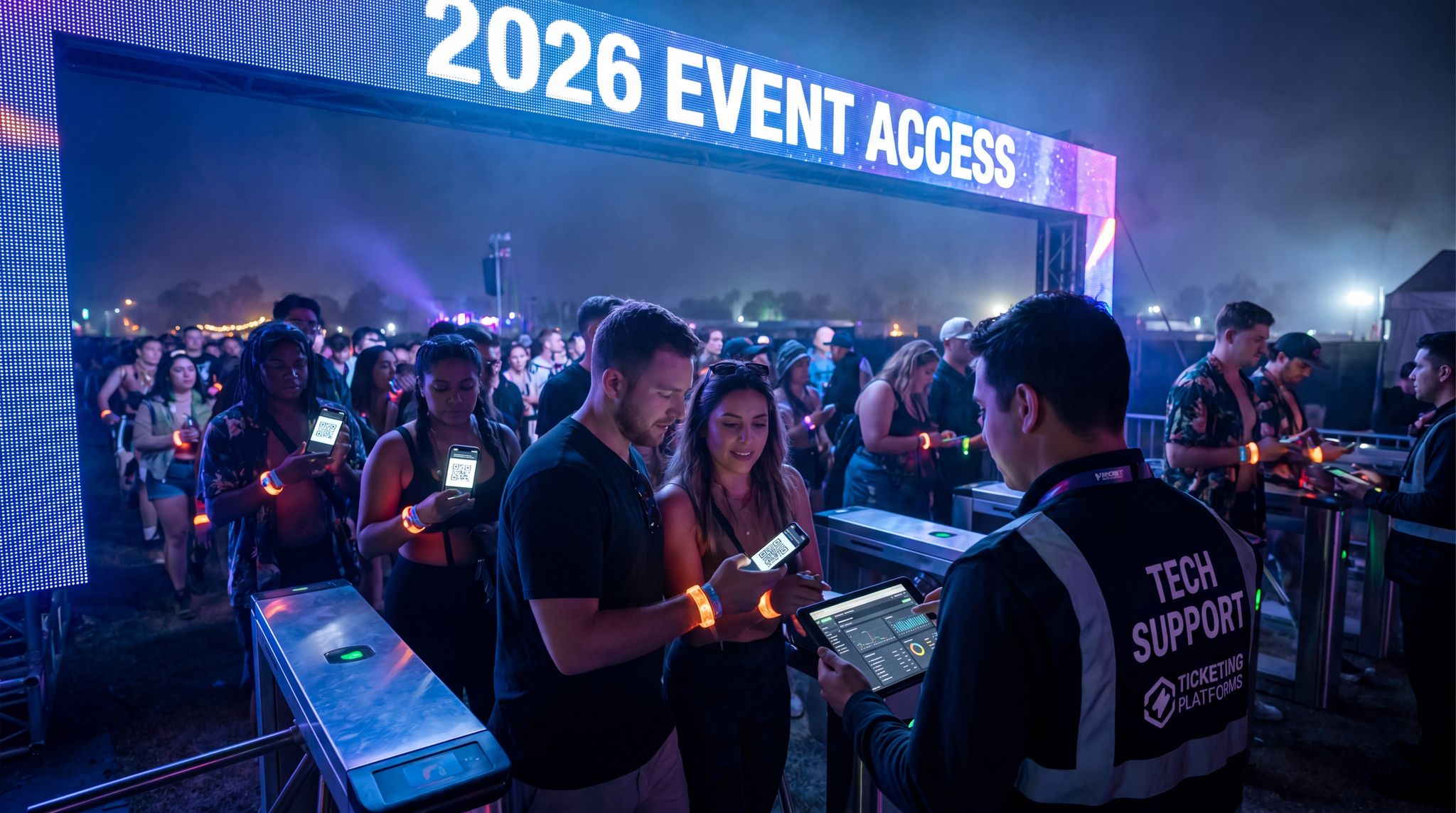
Smooth Entry With Mobile Check-In
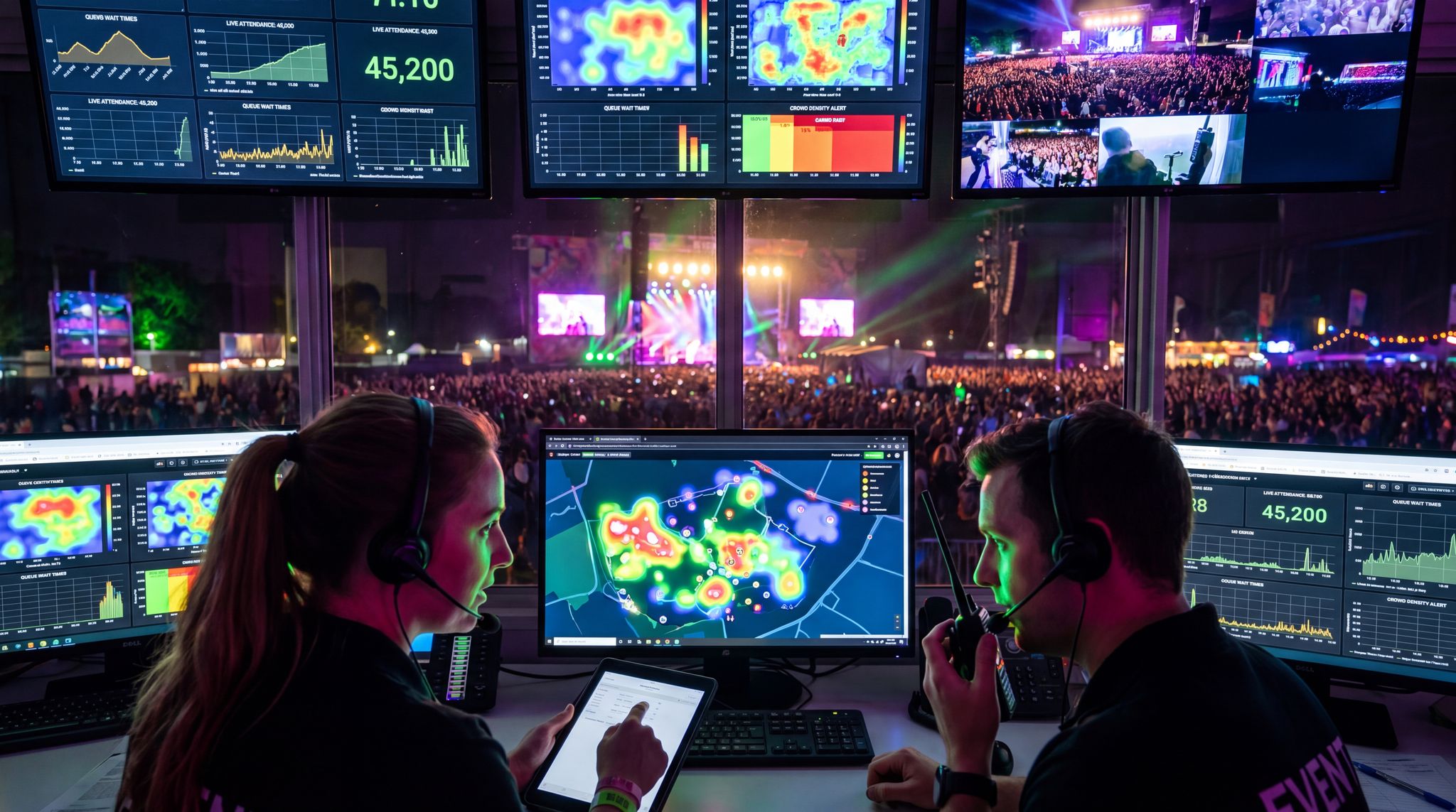
Scan tickets and manage entry with our mobile check-in app. Supports photo ID verification, real-time capacity tracking, and multi-gate coordination.
Pro Tip: Wherever you promote your event (Instagram, Facebook, TikTok, email newsletters), include the URL to your official event page. Make it effortless for interested fans to click through for more details and tickets – the fewer hoops they jump through, the higher the chances they’ll convert to attendees.
Even before your full lineup is ready, launching a preliminary landing page to announce a save the date for your event can capture early interest. A simple pre-registration or waitlist setup allows you to build an email list of highly motivated fans. When you finally reveal the performers and open ticket sales, you already have a warm audience ready to convert.
Ready to Sell Tickets?
Create professional event pages with built-in payment processing, marketing tools, and real-time analytics.
A well-crafted event page also makes your event look legitimate and professional. It centralizes information so prospective attendees aren’t left scavenging across social media for basic details. One experienced festival organizer likened the event page to an official storefront – without it, you’re essentially trying to sell tickets out of an empty lot. When people can easily find the lineup, dates, venue, and pricing on a dedicated page, it reinforces trust that your event is well-organized and worth their time. For instance, think of major festivals like Tomorrowland or Glastonbury – part of their brand credibility comes from comprehensive official websites where fans can explore the festival before ever stepping foot on the grounds. Even for smaller concerts, having an event page on a reputable platform like Ticket Fairy’s event management system signals that the event is genuine and not a scam. In an era where trust is everything, your event page is the digital proof that attendees can count on.
In fact, a well-designed event page can often make the difference between interest and purchase. If your page provides a one-stop destination for all information – from the what/when/where basics to artist announcements, schedules, and FAQs – you solidify your event’s presence in the minds of fans. They know exactly where to go with questions, updates, and of course, to hit that ‘Buy Tickets’ button. As we covered in our guide on strategies to effectively promote your event ticketing page, a well-branded, information-rich event page doesn’t just inform – it actively markets your event by generating excitement and urgency. Over time, consistently hosting your events with strong event pages builds your reputation as a promoter. People begin to recognize your pages and associate them with reliable, quality experiences – an invaluable advantage when you produce future shows.
The Core Aspects of Your Music Event Page
Now that we understand why the event page is so essential, let’s look at how to make yours outstanding. Designing a music event page becomes much easier when you break it down into core elements. Below are four key areas to focus on when creating or revamping your event page to maximize its impact:
1. Make Your Event Page Reflect the Theme of Your Event
If your music event has a unique theme or vibe, make sure your event page brings that theme to life. The visuals, tone, and content of the page should instantly convey what kind of experience attendees can expect. A cohesive theme helps your event page stand out from the crowd, triggering a sense of excitement and even FOMO (fear of missing out) in visitors. People are drawn to experiences that feel special and different – and your page is your chance to show them what sets your event apart.
Free Tool: Split Tickets for Max Gross
Given capacity and a target price, the optimizer proposes Early Bird / GA / VIP allocations and prices — with projected gross at 100%, 80% and 60% sell-through.
For example, the legendary Tomorrowland festival in Belgium builds a fantastical theme each year, and its website mirrors that magic with custom art, animations, and immersive language that make fans feel the festival’s story. Closer to home, if you’re throwing an 80s disco night, your event page might use neon grid backgrounds and retro fonts to instantly scream “80s party!” This consistency reinforces the event’s identity at every touchpoint.
Industry leaders also stress authenticity in presentation. Goldenvoice Vice President Danny Bell observes that what makes great events special is when someone is trying to put their personality out there… it’s such a specific idea, and she creates this magical weekend, a sentiment echoed in Pollstar’s analysis of the 2025 music festival market. In other words, infusing your event page with your event’s distinct personality – its theme, vision, and character – can make it far more compelling to your audience.
Grow Your Events
Leverage referral marketing, social sharing incentives, and audience insights to sell more tickets.
Integrating the theme doesn’t mean overloading the page with gimmicks. It should be done in a tasteful, coherent way. Use your event’s color palette, logos, and signature imagery consistently. If the event is tropical-themed, consider using vibrant paradise visuals (palm trees, sunset tones) in the background or header. If it’s a Halloween rave, maybe the page features dark, spooky graphics with neon accents. These touches make your page feel like an extension of the event itself. The LOCUS Tulum 2023 event page, for instance, embraced its jungle-beach setting by featuring lush green artwork and a sun-soaked color scheme, so anyone who landed there immediately felt the Tulum paradise vibes.
Also remember to coordinate with your web designers or use the tools on your ticketing platform to implement these theme elements. If you’re using a hosted ticketing page, see if it lets you customize the look and feel. On Ticket Fairy’s customizable event platform, for example, organizers can easily tailor their event pages with custom banners, backgrounds, and colors to match the event theme. Taking the time to polish these details goes a long way – a themed event page not only looks unique and professional, it also signals to fans that the event experience will be just as special.
Pro Tip: Use high-quality visuals from past events or the venue to communicate your theme instantly. Include a catchy tagline that emphasizes the experience (for example, Drum & Bass Paradise in Tulum for a beachside D&B festival) at the top of your page. A striking image coupled with a memorable tagline can hook visitors and give them a taste of the atmosphere you’re curating.
2. Consider Aesthetics
Looks matter when it comes to event pages. A visually appealing page can captivate visitors and keep them engaged longer. Think bold, relevant images, easy-to-read text, and a layout that guides the eye to important details. Humans form first impressions of a webpage extremely fast – one study found it takes only about 50 milliseconds (0.05 seconds) for users to form first impressions of a website’s visual appeal. If your page looks outdated, cluttered, or bland at first glance, you risk losing potential attendees in an instant.
Free Tool: When Should You Announce?
Pick your event date and genre — the free planner outputs a recommended announce, presale, on-sale and reminder schedule anchored to how your audience actually buys.
When planning aesthetics, identify the elements you want to shine. Perhaps it’s the headliner’s photo at the top, or a stunning shot of the venue crowd. Use high-resolution images that load quickly (optimize file sizes to avoid slowing the site) and stick to a complementary color scheme. If your event has official artwork or a poster, incorporate those visuals so the branding is consistent everywhere.
Also, ensure the page design is clean and uncluttered. White space (empty space between elements) can actually help important info stand out. Break text into sections with subheadings or bullet points – for example, separate blocks for the lineup, the schedule, and venue details – so readers can easily scan the page. Remember that many users will view your page on phones or tablets, so responsive design is a must. Your layout should automatically adjust and still look great on smaller screens. In fact, roughly 48% of festival-goers now prefer a mobile-first ticketing experience, so a page that isn’t mobile-friendly could turn away nearly half your potential audience.
Maintain brand consistency in your aesthetics too. The logo, colors, and fonts on your event page should match your event’s overall branding (from social media posts to flyers) – a practice strongly recommended by industry groups like IFEA. Consistent visuals build recognition and trust. An attendee should be able to say, “Yes, this looks like that festival I saw on Instagram,” as soon as they open your page.
Real-world example: if you check a top festival’s site on your phone, it’s just as engaging as on desktop – images resize nicely, text is easy to read without zooming, and buttons (like the ticket purchase CTA) are thumb-friendly. Aim for that level of polish. Pay attention to font choices and contrast as well; creative fonts or color schemes must still be legible. Dark text on a light background (or vice versa) usually works best for readability. The goal is to make your event page beautiful yet functional, balancing creative flair with clarity and usability.
3. Strategically Place Relevant Information on Your Event Page
A great look grabs attention, but it’s the information on your event page that ultimately convinces someone to attend. The key is to present all the important details clearly and logically. Start with the basics at the top: What, When, and Where. The name of the event, the date(s) and start time, and the location/venue should be immediately visible as soon as someone lands on the page – often this is in the header or hero section. This way, no one has to hunt for the fundamental facts.
Next, ensure the ticket purchase link or button is prominent. If you’re selling tickets through this page (as most events do), don’t bury the ticket section far down. Many high-converting event pages have a bright “Buy Tickets” or “Get Tickets” button near the top, or a sticky header that always shows a ticket icon. Make it impossibly easy for an excited visitor to initiate a ticket purchase. The moment someone decides “I’m in!”, they shouldn’t have to search or scroll extensively to find how to buy a ticket.
Beyond the basics, include a short and compelling description of the event – think of it as your pitch or elevator speech. In a few concise sentences, tell people what’s special about this event. Is it the artist’s only show in the region this year? A festival’s 10th anniversary edition with a special lineup? A charity concert with proceeds going to a cause? Highlight the unique selling points upfront. After that, you can provide more details like the full lineup or schedule, and any other essentials such as age restrictions (e.g. 18+ event), ticket tier options (general admission, VIP, etc.), and perhaps key amenities (“Free parking” or “Camping available”) or restrictions (“No outside food/drink”, “Clear bag policy”).
Be careful not to overload the page with excessive text. Focus on information that helps someone decide to attend; secondary details can go on a separate FAQ page or be sent in a confirmation email after purchase. Studies show that web users typically read at most about 28% of the words on a webpage during an average visit – the majority of people scan rather than read every word. This means you should format your content to be scannable: use bullet points, icons, or bold keywords to draw attention to key info. If a potential attendee can glean all the important details in under a minute of scanning, you’ve nailed the content length.
Consider a complex scenario: as part of your design for a summer music festival, you need to showcase performers, times, and ticket info. With so many elements in play, how can you help your audience focus? The best approach is to utilize progressive disclosure and visual hierarchy. Keep the primary call-to-action (the ticket link) anchored at the top, use a grid layout for the headliners, and place detailed set times or secondary stages inside collapsible accordions or a separate tab. By grouping related data and using ample whitespace, you guide the attendee’s eye naturally without overwhelming them with a wall of text.
You can certainly add engaging extras like photos or a short aftermovie video from past editions to give a taste of the experience – visuals and media can reinforce the excitement. Just ensure these elements are well-placed and don’t distract from critical info. Every piece of content on the page should serve a purpose: either it informs or excites (ideally both). If it doesn’t do either, consider trimming it out.
For example, the event page for LOCUS Tulum 2023 not only looked on-theme, but also smartly put all key details front and center. The dates (March 2–6, 2023), location (Tulum, Mexico), age limit (All Ages), and a ticket button were visible at the top without any scrolling. This way, anyone interested in that drum & bass festival could immediately find the info they needed and proceed to ticket selection. By structuring your page such that the vital details (what, when, where, and how to attend) are impossible to miss, you respect your audience’s time and help them make a decision faster.
Warning: Avoid dumping huge blocks of text or chaotic info on your event page. If visitors have to scroll through endless paragraphs to find the lineup or ticket prices, they may give up. Keep it concise and organized. You can always provide a more detailed FAQ or send out extra info via email to ticket-holders later, but the event page itself should deliver the must-know details and a clear call-to-action without overwhelming people.
4. Consider the Logistics and User Experience
Building your event page isn’t just about what’s on it, but also how it works. Put yourself in the shoes of a visitor and navigate the page as if you were an attendee. Is it easy to find what you’re looking for? Do all the links and media load properly? Any technical hiccup can create friction – and online, friction means lost visitors (and lost ticket sales).
Start by checking the page navigation or layout. If your page is a single long scroll, that’s fine – just make sure sections are clearly separated with headings (e.g. About, Lineup, Tickets, Venue, FAQ). If your page uses tabs or a menu to switch between sections, ensure those labels are obvious and the menu is easy to use, especially on mobile. Too many tabs or a confusing menu can frustrate users. Often for a single-event page, simpler is better: all info on one page, possibly with a sticky menu that jumps to the relevant section on click.
Next, be obsessive about performance. A sluggish event page can doom an otherwise great event. In the live events industry, we know how hype can cause huge traffic spikes when tickets first go on sale. Ensure your ticketing platform or website host can handle the surge of visitors at on-sale time or when you drop a big lineup announcement. The last thing you want is your page crashing just as hundreds or thousands of fans are trying to buy tickets. Load-test if you expect high demand. And always optimize for speed: compress images, eliminate unnecessary scripts or embeds, and use a reliable, modern hosting service. Research shows that if a site takes more than a few seconds to load, many users will simply bail out – roughly 53% of mobile visitors abandon a site that takes over 3 seconds to load. All your hard marketing work could be undone by a slow webpage, so treat performance as a top priority.
Mobile optimization is another crucial logistic. We’ve covered responsive design, but go further and test the entire user flow on a smartphone. Does the page fit nicely on a small screen without horizontal scrolling? Are buttons and links easily tappable? Is the text large enough to read on a phone held at arm’s length? A huge portion of ticket buyers now complete transactions on their phones – one recent report noted about 65% of concert ticket purchases happen on mobile devices. While festivals and other events may vary, it’s safe to say mobile users will be a big chunk of your audience. If the ticket purchase process on your page is clunky on mobile (for instance, if the checkout form isn’t mobile-friendly), you risk losing those buyers. Streamline it: use mobile-friendly payment options, minimal typing (prefill what you can), and test the process yourself on iPhone and Android.
Also, verify that all interactive elements work correctly before you go live. Do a dry run: fill out the ticket purchase form, apply a promo code if you have one, select seats (if applicable), and go all the way through to the checkout confirmation (you can void the test purchase later if needed). Click every link on your page – does the map to the venue open? Do the social media or artist links work? It’s worth spending 15-20 minutes to catch any broken links or errors. Many attendees won’t report problems; they’ll just leave, so you might never know you lost a sale due to a glitchy page.
Here’s a quick pre-launch checklist to ensure your event page delivers a smooth user experience:
Go Cashless With RFID Technology
Enable contactless payments, faster entry, and real-time spending analytics with RFID wristbands and NFC-enabled ticketing for your events.
| Pre-Launch Event Page Checklist | Details |
|---|---|
| Navigation & Layout | Sections are clearly labeled or segmented. Important links (like Tickets) are obvious. |
| Load Speed | Page fully loads within ~3 seconds on typical connections (test on 4G/5G mobile). |
| Mobile Usability | Page adapts to different screen sizes. Text is readable without zooming. Buttons and links are easy to tap. |
| Ticket Purchase Flow | Test the entire buying process on multiple devices. No errors or confusing steps. |
| Content Accuracy | All information is up-to-date (lineup, times, prices). No placeholder text or outdated info lingering. |
A smooth, reliable page experience creates a positive impression of your event before anyone even arrives. Conversely, if your page is buggy or hard to use, people might assume the event itself could be disorganized. Don’t give them that doubt – double-check the logistics and user experience so that nothing detracts from the excitement you’ve built.
For promoters looking to streamline this entire process, understanding how to optimize events with Ticket Fairy (or similar advanced ticketing ecosystems) is a game-changer. The platform automatically handles heavy traffic loads, provides mobile-optimized checkout flows, and offers deep analytics to track conversion rates. Whether you are operating locally or expanding internationally, leveraging these built-in optimization tools ensures your page performs at its peak, allowing you to focus on producing an incredible show rather than troubleshooting web errors.
Warning: If your event page is slow or difficult to navigate, potential attendees may leave before securing their tickets. Test everything – from load times to the checkout process – ahead of your on-sale. More than half of users won’t tolerate a sluggish site, as 53% of mobile visitors abandon slow-loading pages, so a clunky page can directly translate to lost revenue.
Conclusion
A strong music event page isn’t just a minor detail in event planning – it’s the digital heart of your event’s marketing and attendee experience. By ensuring your page reflects your event’s personality, looks professional, presents information clearly, and operates flawlessly, you dramatically increase the chances of turning curious visitors into excited ticket-holders. In today’s live events landscape, fans expect information at their fingertips and an online journey that matches the thrill of the show. Your event page is where expectations are set. Take the time to elevate it to the next level, and you’ll not only sell more tickets but also build trust and credibility that carry into your future events. Happy planning!
Frequently Asked Questions
Why is a dedicated event page essential for music festivals?
A dedicated event page serves as the primary information hub and validates the event’s existence, building trust against ticket scams. Industry data shows event websites account for approximately 41% of all ticket conversions, making them a critical channel for turning casual interest into actual purchases and conveying the event’s vibe.
How can organizers reflect an event’s theme on their ticketing page?
Organizers should use consistent visuals, color palettes, and tone that mirror the event’s vibe, such as neon grids for 80s nights or tropical visuals for beach festivals. This consistency creates an immersive experience, triggers excitement, and helps the page stand out while signaling a professional, cohesive event identity.
What are the most important details to include on a music event page?
The core details—What (event name), When (date/time), and Where (venue)—must be immediately visible at the top of the page. A prominent “Buy Tickets” button should accompany these basics. Secondary details like lineups and FAQs follow, ensuring visitors can find essential information without extensive scrolling or searching.
Why is mobile optimization critical for concert ticket sales?
Mobile optimization is vital because approximately 65% of concert ticket purchases occur on mobile devices. If a page is not mobile-friendly or takes longer than three seconds to load, nearly 53% of visitors may abandon the site, resulting in significant lost revenue and frustrated potential attendees.
How does visual aesthetics influence event page visitors?
Users form first impressions of a website’s visual appeal in just 50 milliseconds. High-quality images, clean layouts, and readable fonts are essential to captivate visitors instantly. An outdated or cluttered design can cause potential attendees to leave immediately, while a visually appealing page keeps them engaged and encourages ticket sales.
How does a professional event page prevent ticket fraud?
A professional, dedicated event page acts as an official storefront that validates the event’s reality, distinguishing it from scams on social media. With ticket fraud costing millions annually, a centralized hub with official details and direct ticketing links builds necessary trust and assures fans they are purchasing legitimate passes.
How can you help your audience focus when showcasing performers, times, and ticket info for a large festival?
To help your audience focus when presenting complex details like performers, set times, and ticket tiers, use visual hierarchy and progressive disclosure. Keep the primary “Buy Tickets” button anchored, highlight headliners in a clean grid, and use collapsible sections or tabs for granular schedule details. This prevents information overload while keeping essential data accessible.